Xuan Hoa was going through a business transformation from state-owned enterprise to joint-stock company. Besides, the new brand also needs a re-positioning to approach the higher segment.
Modernizing the brand identity system of the Xuan Hoa brand, creating a strategic foundation for marketing plans and activities in 2020.
Ensuring brand messages are conveyed effectively based on the customer psychology of Xuan Hoa. The media perspectives fully show the values of Xuan Hoa.
Consulting and developing brand architecture.
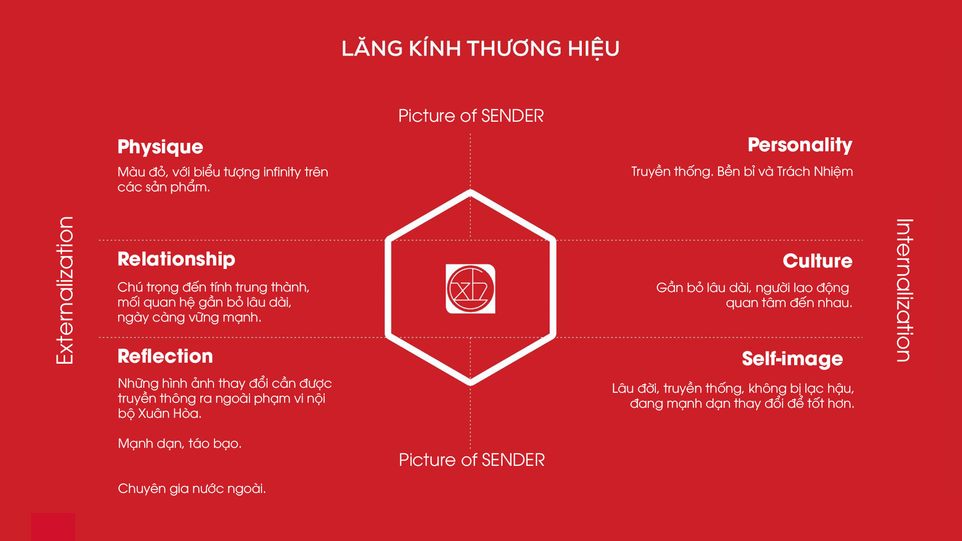
Consulting and building brand strategy: brand personality, brand structure, brand tagline, value statement.
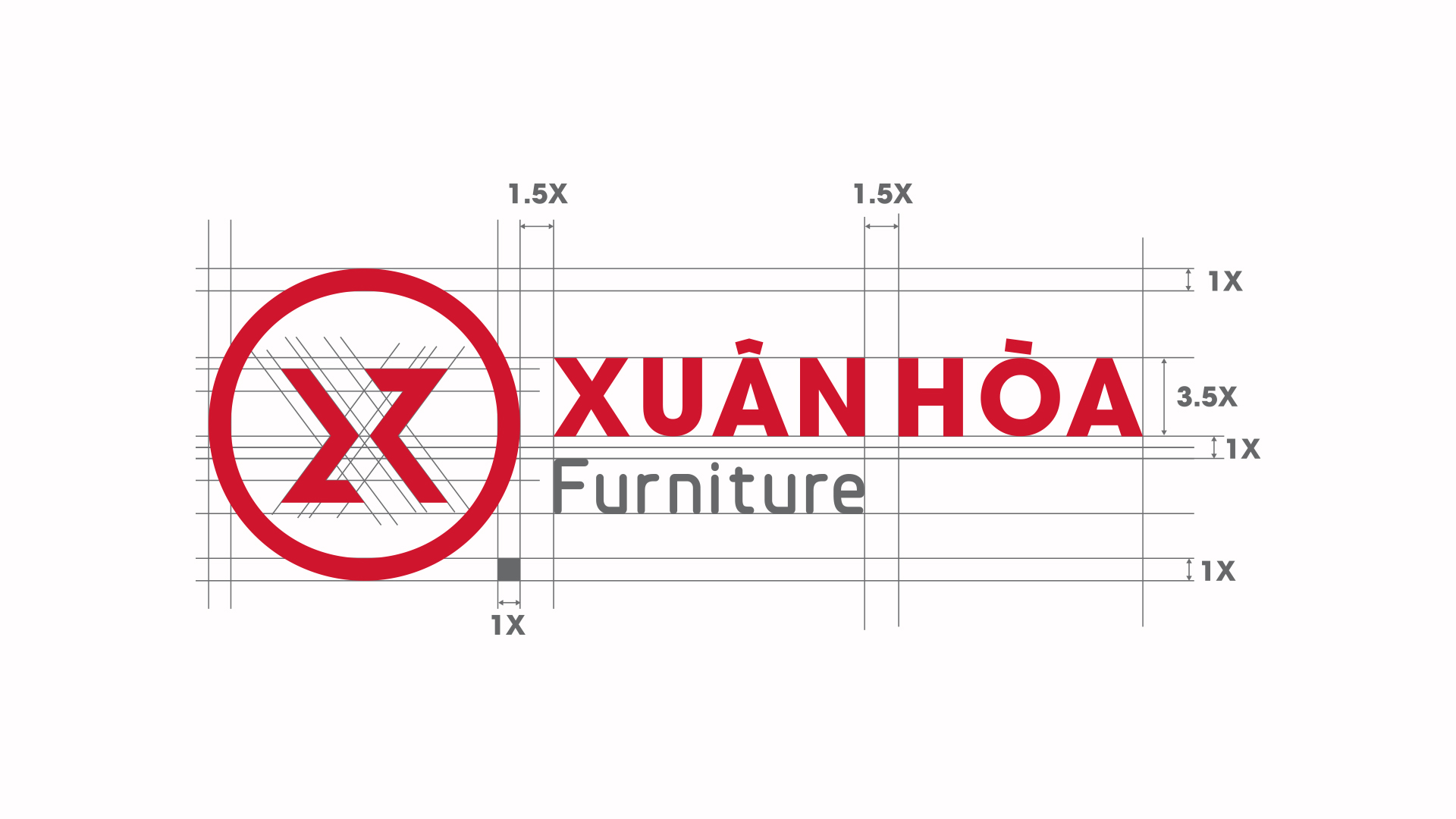
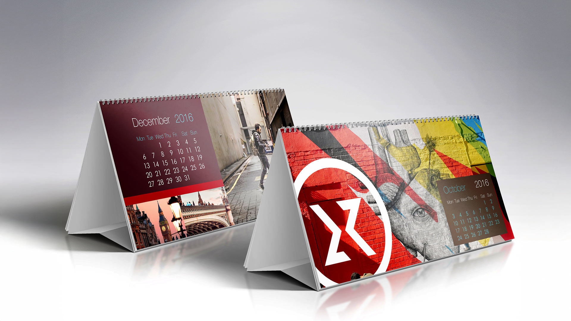
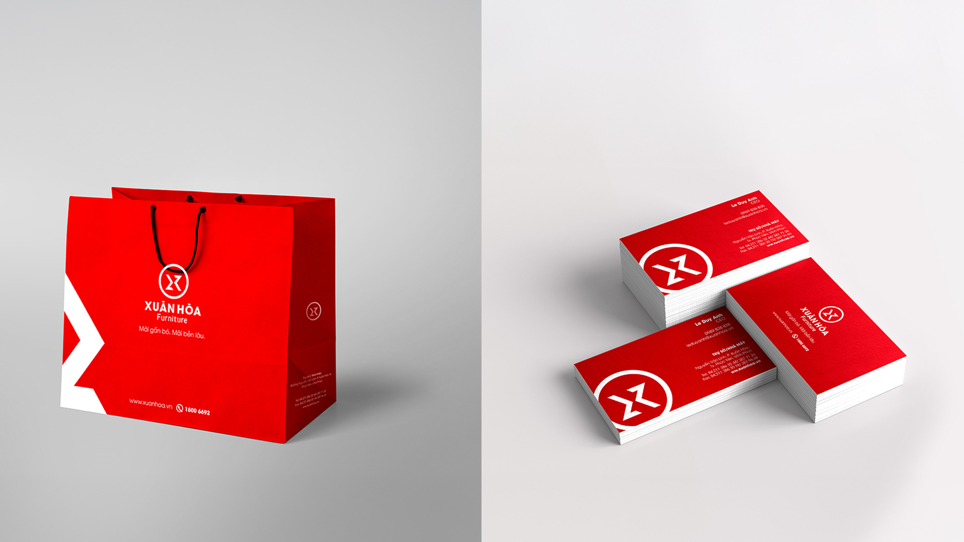
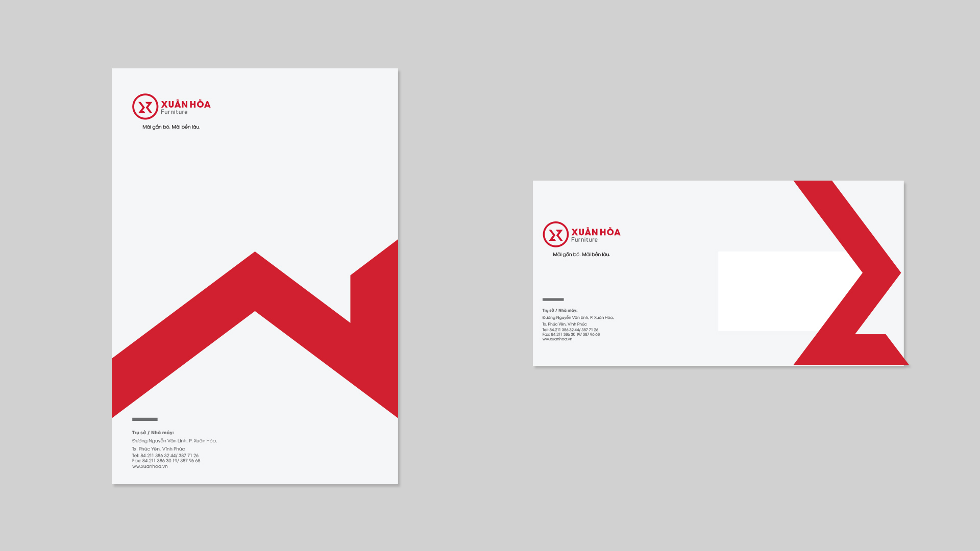
Building a brand identity system: logo, brand color, art direction, brand pattern, typography, application to publications.
Brand structure: Branded house, taking the Xuan Hoa brand as a fulcrum for brands with different segments from the traditional segment of Xuan Hoa.
Successfully developed the value statement “Global Standard – Sustainable value” for the Vietnamese market.
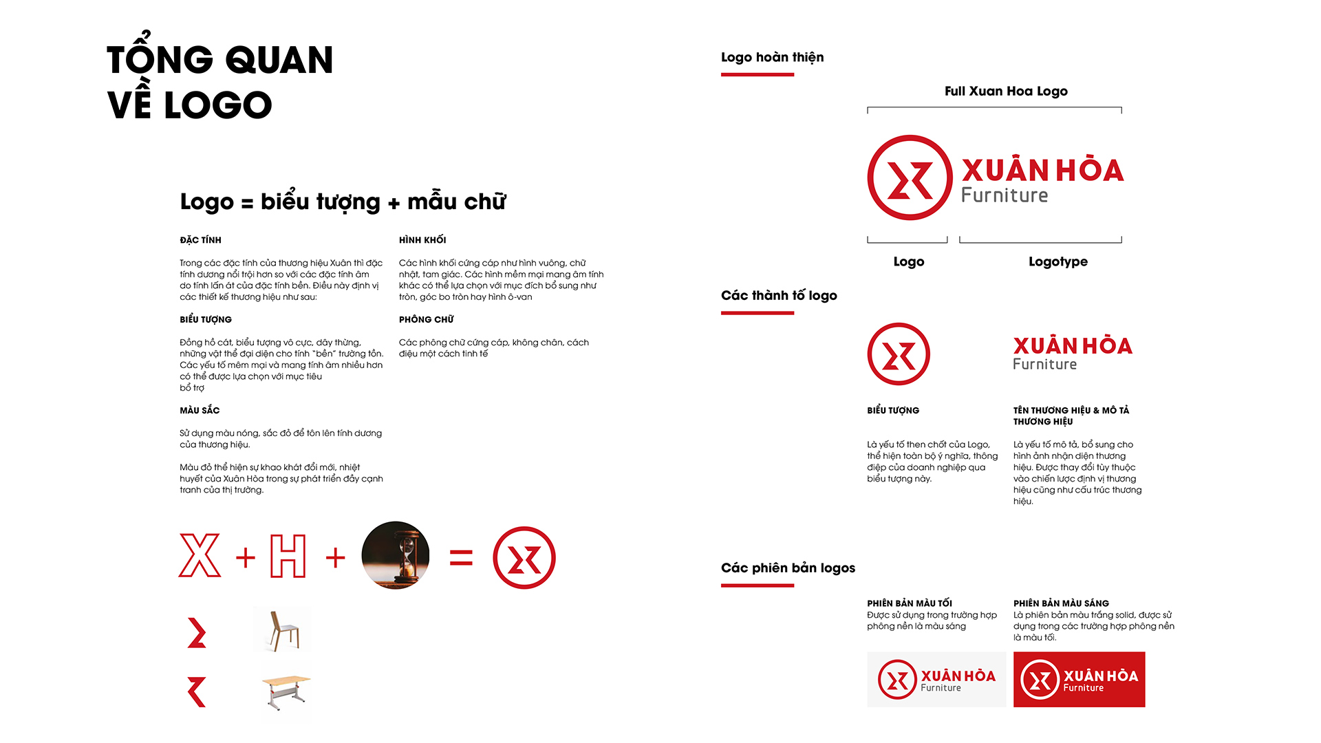
About the meaning of the Xuan Hoa logo:
Icon: the hourglass, infinity symbol, rope, any objects that represent “durability”. Softer and more yin elements can be used to supplement.
Color: Wisdom Agency uses hot colors, specifically red to highlight the yang of the brand. Furthermore, the red color represents Xuan Hoa’s passion for innovation and enthusiasm for the market’s competitive development.
Cubes: choose sturdy blocks such as squares, rectangles, triangles to show the yang of Xuan Hoa. And add other soft shapes such as round, rounded corners or oval shapes to show yin, bringing a balance of yin and yang to the brand.
Fonts: sturdy, sans serif, subtly stylized.
