Even though TOEIC MASTER has been developing effectively in the North market, entering the South presents many powerful competitors, like VUS, ILA,…, making it even harder to stand out in the eyes of the public.
The problem posed to TOEIC MASTER is:
Differentiating the TOEIC Master brand with the meaning of “MASTER”: Overcome – Conquer – Master.
Creating a journey, clarifying the message you want to convey: helping students in all stages of the journey, from mastering basic English skills to conquering the TOEIC test, to serve their lives or those who need them for their dream job.
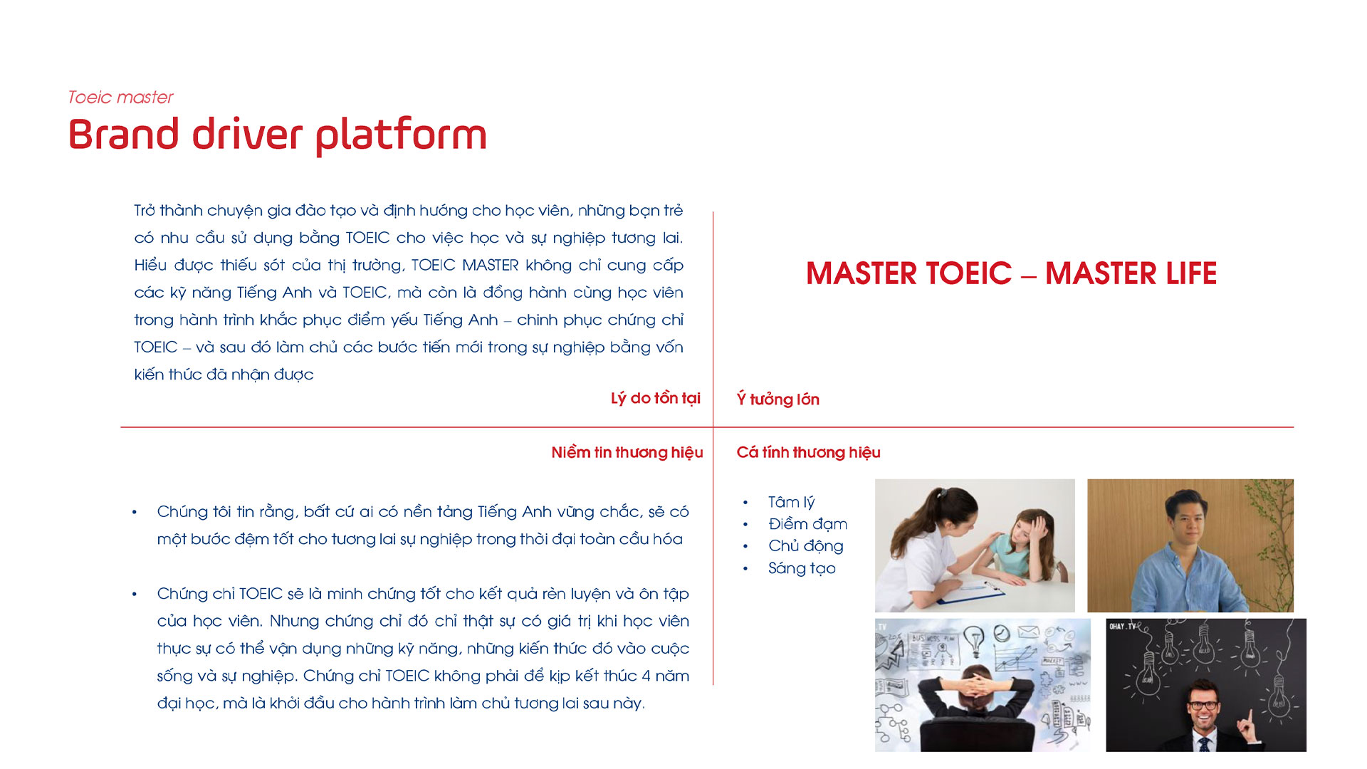
Consulting brand strategy: brand architecture, value statement, brand idea, brand message, brand personalities, brand belief.
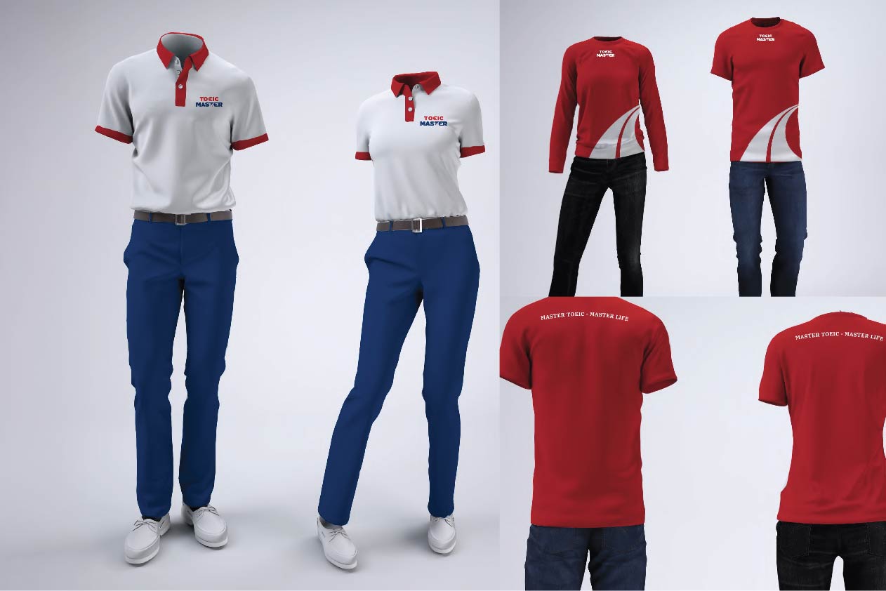
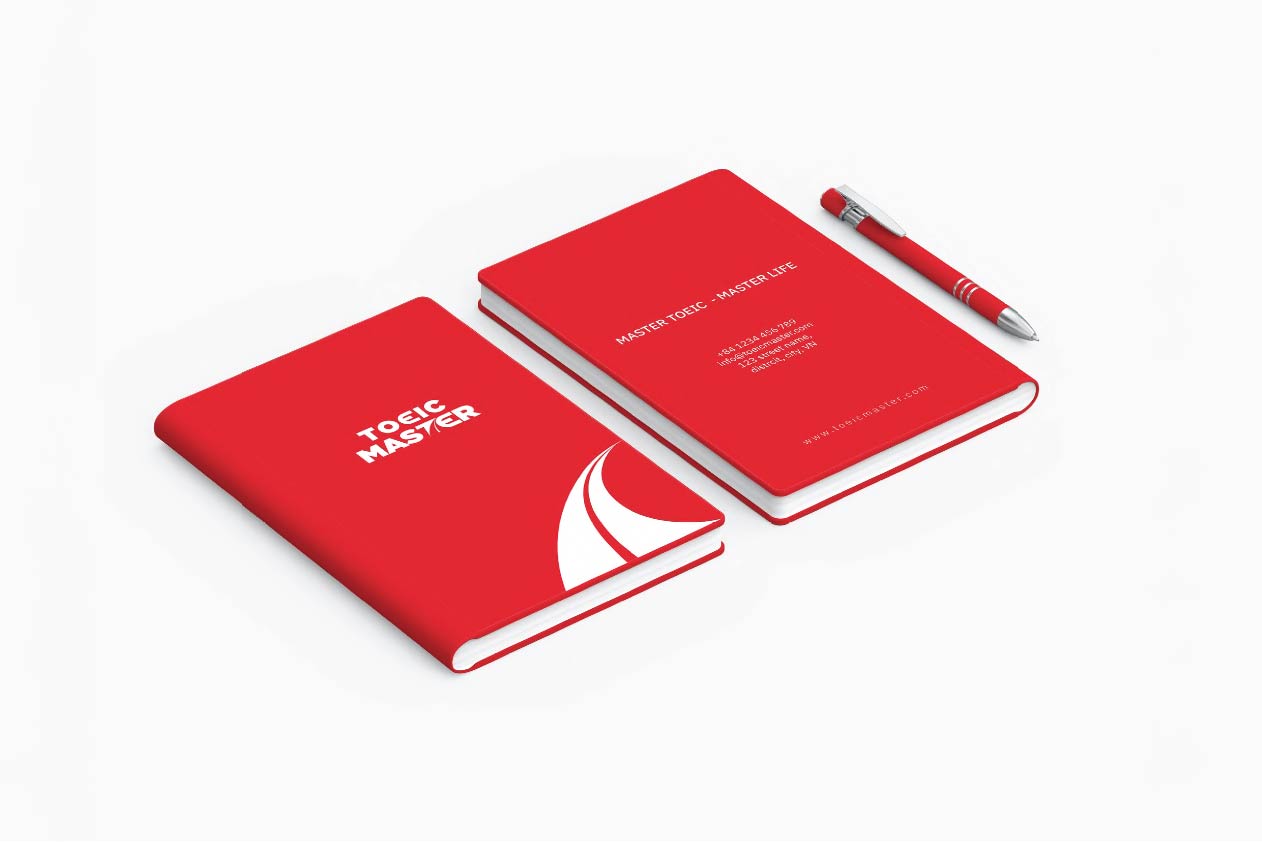
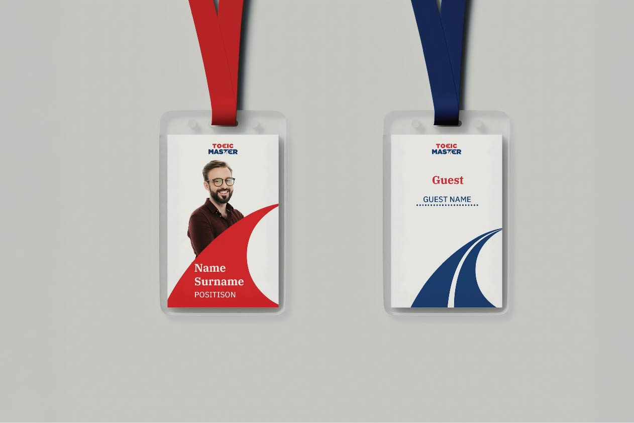
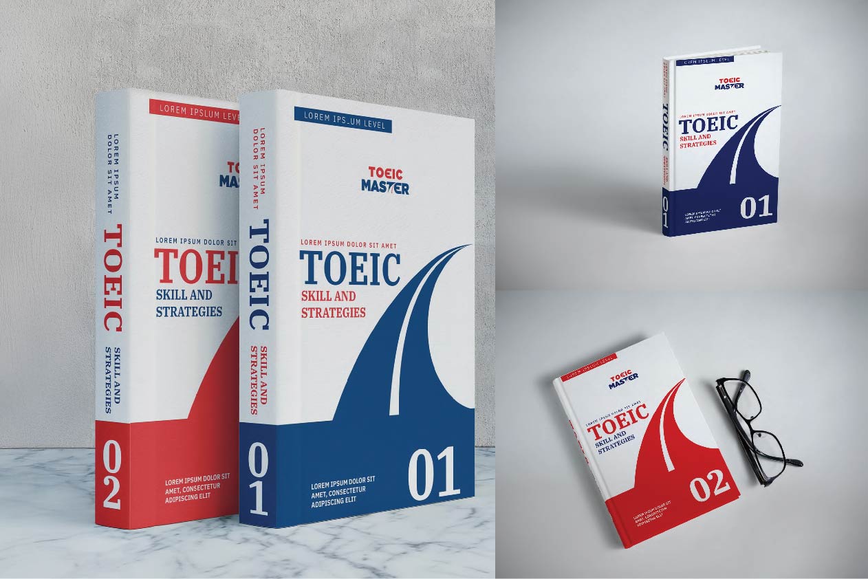
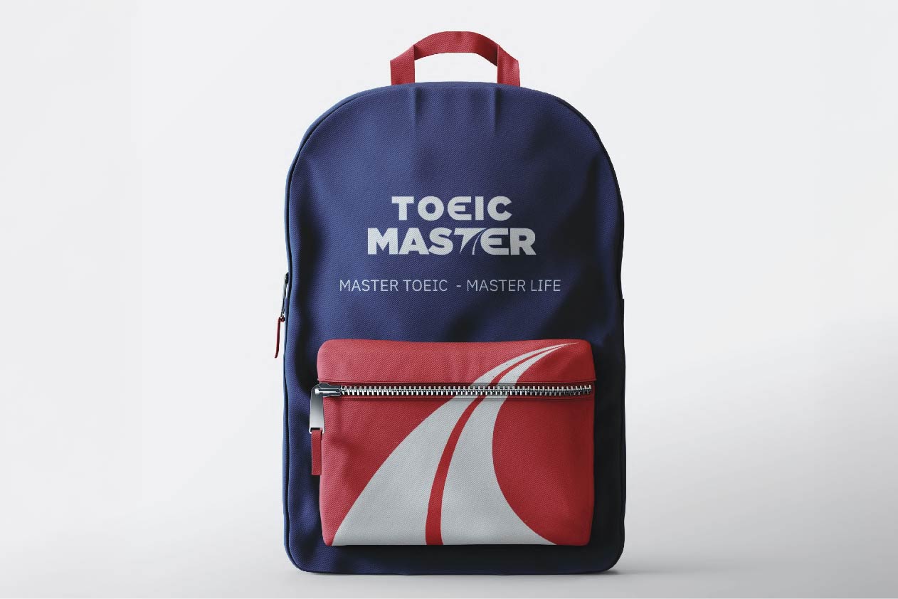
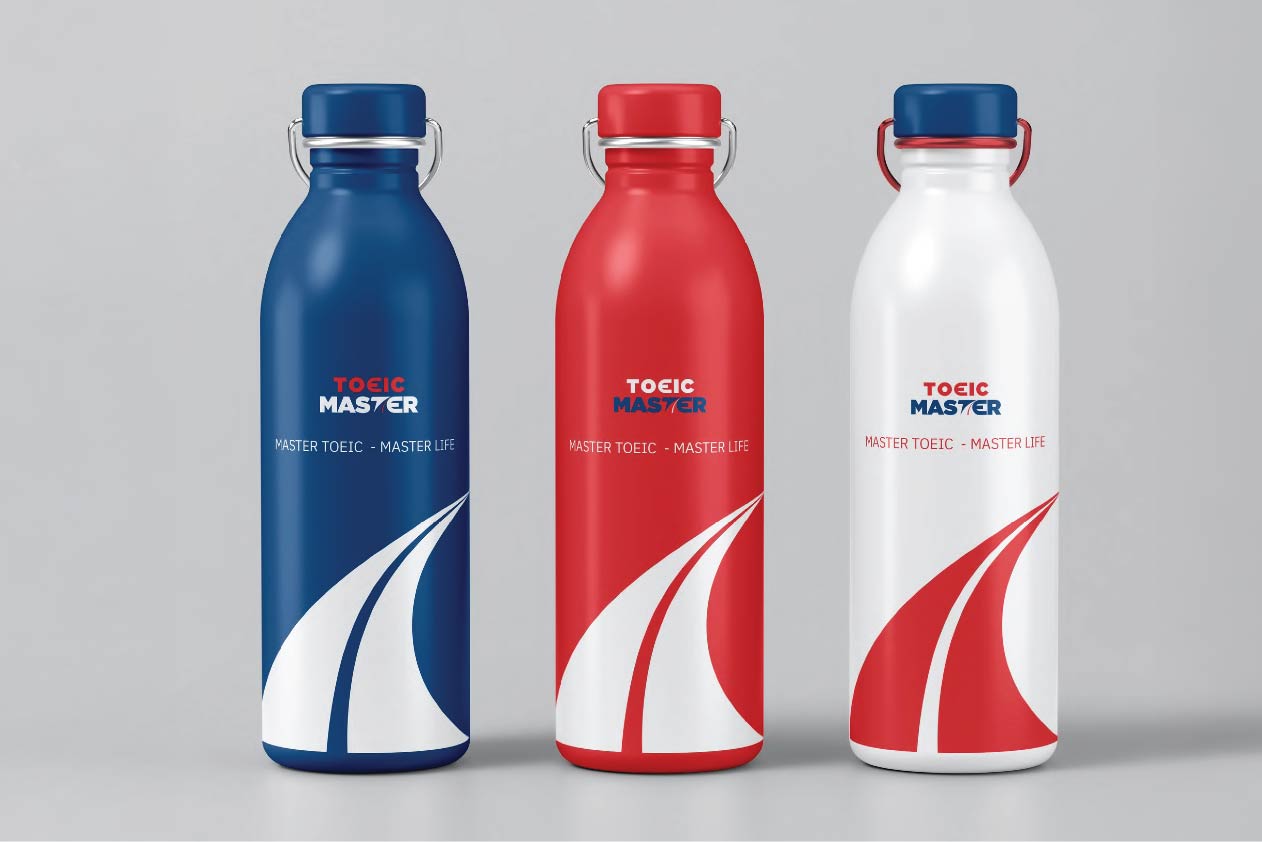
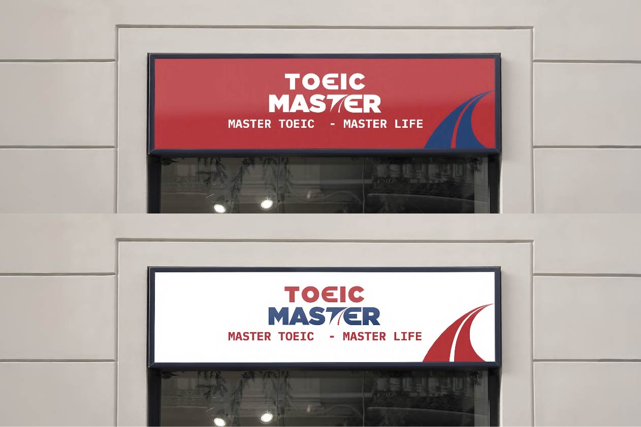
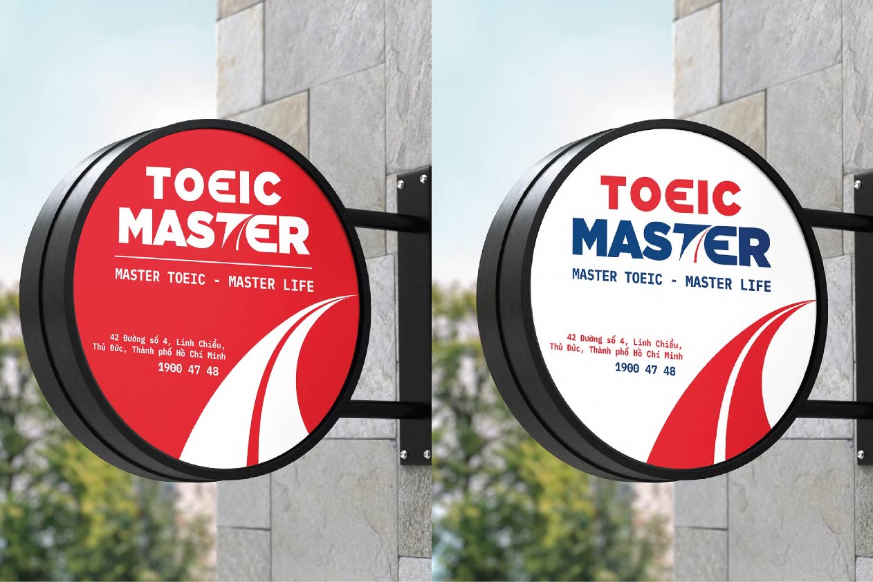
Building brand identity: Logo, brand colors, art direction, brand pattern, typography, application to publications.
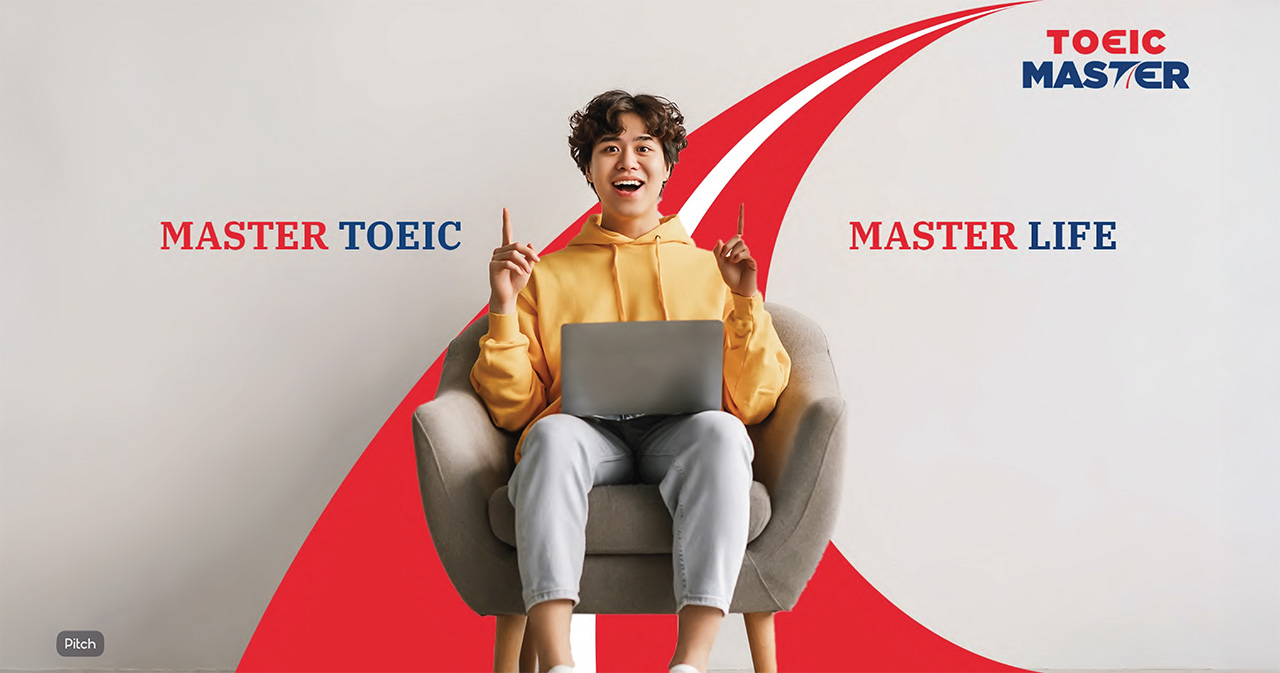
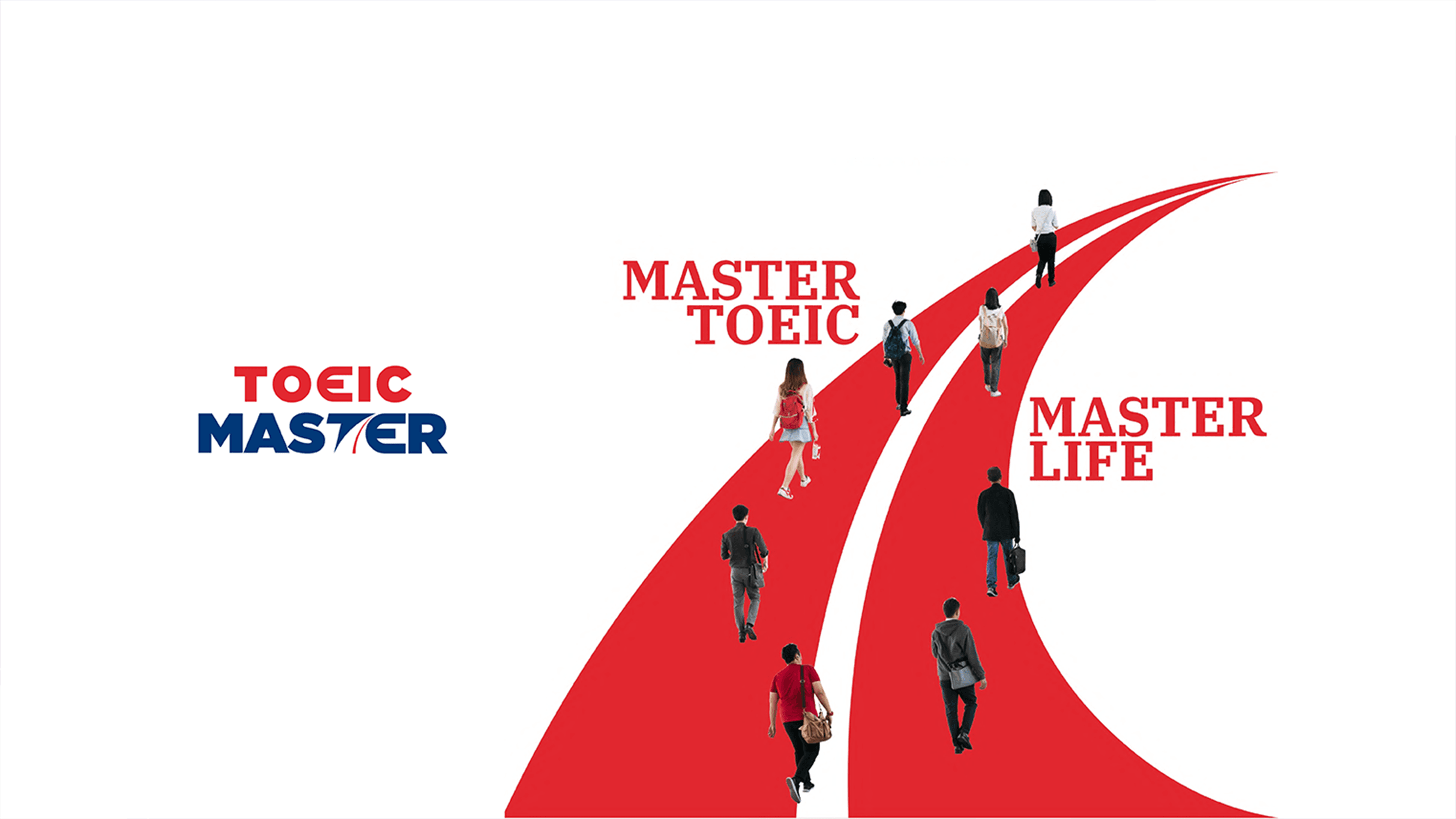
Successfully developing the big idea “MASTER TOEIC – MASTER LIFE”, based on the customer’s desire to be able to use their English skills outside of the classroom, at work, and in daily life. They demand more than just a certificate that can be applied in the real world.
About the meaning of the TOEIC Master logo:
